











Localizing an Online Learning App from English to Japanese
Localizing an AI-powered English learning app for children in Japan through UI/UX optimization, child-friendly translations, and a culturally relevant landing page.


Entering the Japanese digital market requires more than just translation—it demands a deep understanding of cultural expectations and user behavior. For international companies, Japanese website design and UI/UX present a unique blend of high information density, visual vibrancy, and values rooted in hospitality and thoroughness. What may seem cluttered or overly complex to Western audiences is often perceived in Japan as trustworthy, detailed, and considerate.
This guide demystifies the core principles behind Japanese digital aesthetics and user experience, helping global brands adapt their online presence for authentic connection and lasting impact. Whether you're launching a new product or localizing a website, aligning with Japanese expectations is crucial for building trust and ensuring success in one of the world’s most nuanced digital markets.
Japan’s digital landscape presents a fascinating mix of tradition, cultural nuance, and evolving technology that sets its website design and UI/UX apart from Western approaches. For international companies aiming to enter or succeed in the Japanese market, understanding these differences is essential—not just in how websites look, but also in how users interact with them and what they expect from the experience.
While website design in Japan often appears more complex, dense, and information-rich compared to the minimalist trends popular in the West, this is not seen as negative. In fact, Japanese users tend to associate detailed layouts with trustworthiness and thorough service. Similarly, Japanese UI/UX practices reflect deep-rooted cultural values such as hospitality (Omotenashi), continuous improvement (Kaizen), and careful consideration for others (配慮).
We will explore:
In the following sections, we will break down these differences and offer practical insights into how global brands can thoughtfully adapt their digital strategies to align with Japanese expectations.
Japanese website design and Western website design differ in ways that go beyond mere aesthetics—they reflect distinct cultural mindsets and communication styles.
One of the most striking differences lies in information density. Japanese websites often appear visually busy, with dense text, banners, sidebars, and multiple call-to-actions all present on a single page. This design approach is rooted in the Japanese preference for providing as much information as possible upfront. In Japan, complexity is not viewed negatively; instead, it can signal thoroughness, trustworthiness, and attentiveness to user needs.
By contrast, Western websites generally favor minimalism—clean layouts, larger whitespace, and a focus on a single key message per page. This reflects the Western design principle of “less is more,” where simplicity is associated with clarity and elegance.
Additionally, Japanese websites frequently use bright colors, animated banners, mascots, and characters to create warmth and familiarity. Many sites include multiple navigation menus, sometimes stacked in sidebars or at the top and bottom of the page, offering users a variety of pathways to information. This mirrors Japan’s cultural emphasis on offering choices and avoiding forceful persuasion.
In comparison, Western web design typically opts for fewer navigation options and streamlined user journeys, reducing cognitive load and keeping users focused on conversion goals. Typography also differs: Japanese websites often use multiple font styles, sizes, and colors to create visual hierarchy, whereas Western designs maintain consistency and restraint in typographic choices.
The differences in UI/UX between Japanese and Western digital experiences are equally significant and often more subtle, rooted in deeply held cultural values.
In Japan, users tend to feel more comfortable when:
Western UI/UX, by contrast, tends to prioritize:
For instance, while a Japanese e-commerce site may offer extensive FAQs, reviews, and multiple purchase options on a single page, a Western site would likely simplify this to a clear “Buy Now” path with optional deeper content placed further down or on separate pages.
Moreover, in Japan, users often expect websites to maintain a degree of formality and politeness in language, even on digital platforms—this is less common in Western UI/UX, which tends to adopt more casual, conversational tones.
Finally, while both cultures increasingly embrace mobile-first design, Japanese users still place high importance on detailed navigation menus and clear trust signals (e.g., certifications, guarantees) even on mobile screens—details that Western minimalism often omits.

While minimalism is a valued aspect of Japanese aesthetics, evident from serene gardens to Muji and Uniqlo's simple designs, Japanese website design and UI/UX often tell a different story. They reflect a culture that values thoroughness, hospitality, and attention to detail. For international companies, understanding both the visual design differences and user experience expectations is crucial for successfully localizing a digital presence in Japan.
Below, we explore the distinct features of Japanese website design and the unique tendencies in UI/UX, while comparing them with Western standards to help you tailor your approach effectively.
Japanese Website Design:
A defining characteristic of Japanese websites is their dense, information-rich layouts. Pages are often filled with detailed content, multiple sidebars, banners, and layered navigation menus—all within a single screen. This approach reflects Japan’s cultural emphasis on thoroughness, efficiency, and hospitality (Omotenashi), where providing all relevant information upfront builds trust and reduces uncertainty for users.
Rather than using white space to create visual breathing room, Japanese websites tend to maximize space by stacking content vertically and horizontally. This mirrors not only the crowded, compact nature of Japan’s urban spaces but also the cultural preference for choice and self-guided decision-making.
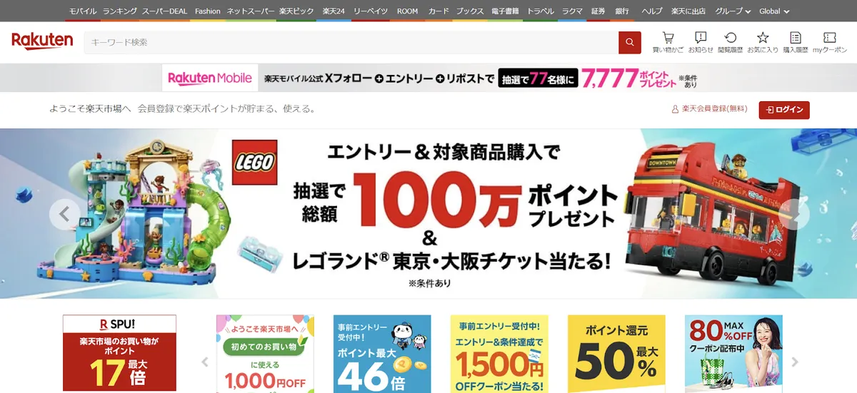
The Rakuten Japan homepage offers multiple product categories, time-sensitive deals, and a wide array of links, ensuring users can find whatever they need without excessive navigation.

Kinokuniya Japan features densely packed book categories, promotions, and recommendations on its main page.
Western Website Design:
In contrast, Western websites prioritize minimalism, clarity, and simplicity. The focus is on presenting one core message or action per page, using larger images, fewer words, and clear call-to-actions. White space is used deliberately to create a sense of ease and focus.
The typical Western user journey is linear and guided—users are encouraged to follow a streamlined path without being distracted by too many simultaneous options.
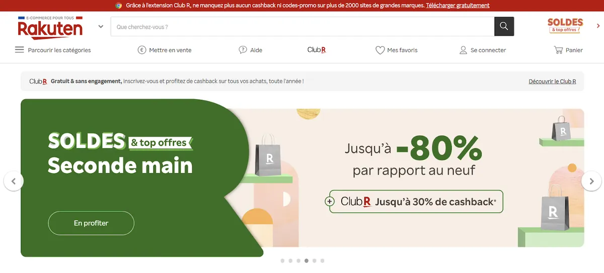
Rakuten France or limit the amount of information on the screen, using clean layouts and visual hierarchy to gently guide the user.
Japanese UI/UX:
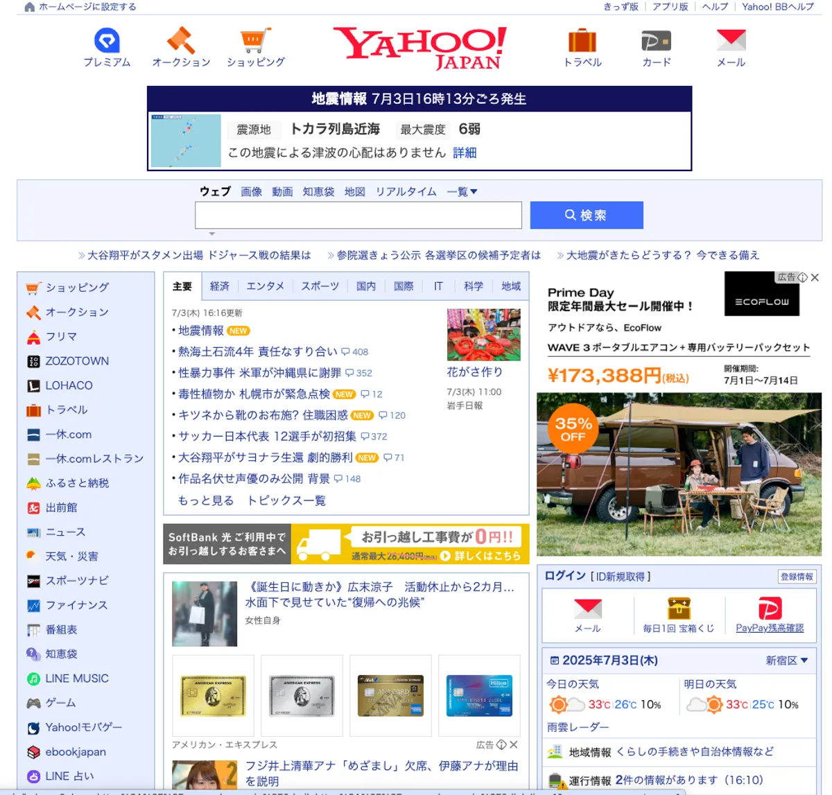
Example: Yahoo! Japan and Nissen Japan use multiple navigation layers and animated mascots to engage users.
Western UI/UX:
Example: Apple.com (US) guides users with simple messaging and minimal distractions.
Japanese Website Design:
In Japanese websites, images are used functionally rather than emotionally. Rather than dominating the screen with large visuals, Japanese websites tend to use smaller, carefully optimized images that serve as navigational aids or as visual breaks between text-heavy sections. This strategy ensures that users can still access dense information without feeling overwhelmed.
This approach reflects two key cultural values:
Japanese UI/UX emphasizes maintaining high engagement through balance—images, icons, and banners are used to break monotony, but the primary goal is to keep information accessible and organized. Additionally, Japanese websites often favor character mascots, illustrated icons, or playful visuals—even on corporate or government sites—as a way to humanize the interface and create a sense of friendliness.
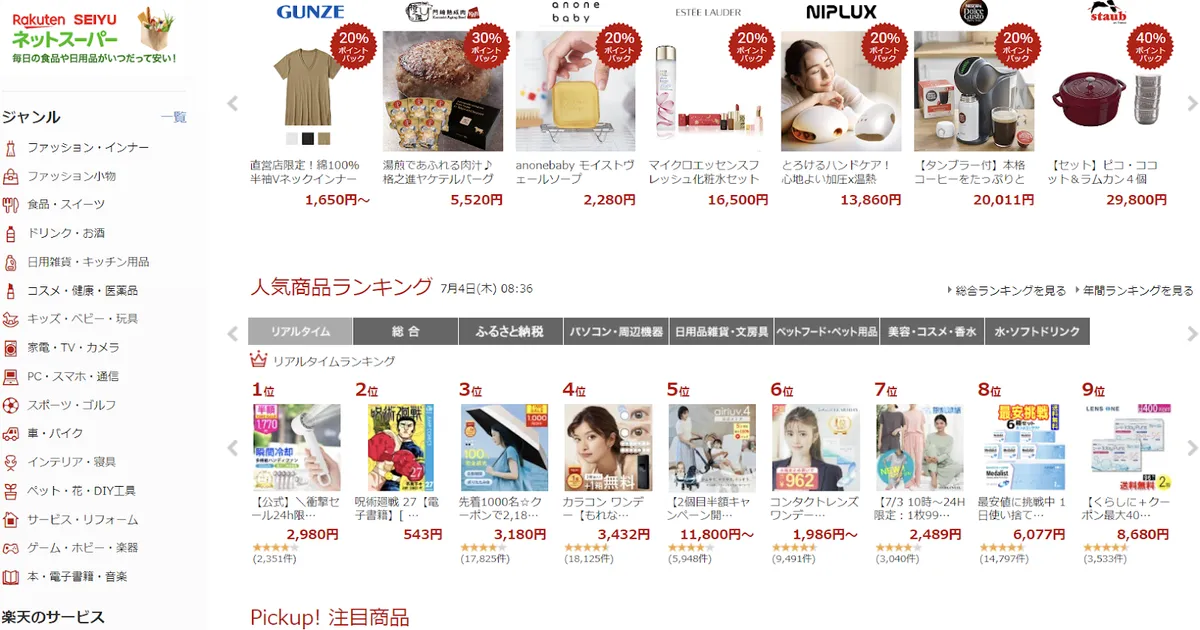
Here on Rakuten Japan, images are small yet plentiful—product thumbnails, promotional banners, and navigation icons coexist on the same page to keep users visually engaged without slowing down performance.
Western Website Design:
In Western markets, images are often the centerpiece of the design, serving to create an emotional connection or to tell a brand story. Large, high-quality, high-impact visuals dominate landing pages—often with minimal accompanying text.
Western UI/UX leans toward simplicity in content but richness in visuals. The focus is often on creating an aspirational feeling—for example, lifestyle images in fashion, immersive product photography in tech, or emotional brand messaging.
Additionally, Western websites often use images to set the tone or mood of the site, rather than to convey granular information. There’s a heavier reliance on hero images, full-width banners, and cinematic content.
For example, sites like Zara (US) or Nike.com lead with large-scale, high-resolution imagery, often with very few words, placing emotional appeal at the forefront of the user journey.
When localizing, companies should resist the urge to “downsize” Western visuals completely, but should adapt by breaking up images into smaller components and placing them alongside detailed content in the Japanese context.
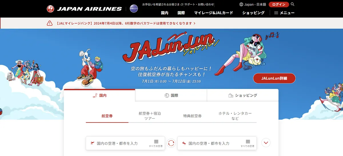
Source: Japan Airlines’ homepage for Japanese-speaking customers
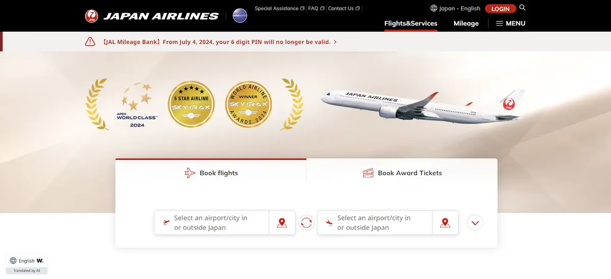
Source: Japan Airlines’ homepage for English-speaking customers
Japanese Website Design:
In Japan, color plays an active, dynamic role in grabbing attention, organizing content, and communicating emotion. Japanese websites frequently use bright, high-contrast colors—especially reds, yellows, blues, and greens—to highlight promotions, limited-time offers, and important sections. It is not uncommon to see multiple color highlights on the same page.
This vivid use of color reflects cultural tendencies toward visual excitement and engagement—especially in retail, entertainment, and e-commerce. The choice of color can also reflect seasonal changes, festivals, or regional preferences, creating a website that feels alive and responsive.
In Japanese UI/UX:
Additionally, colors are sometimes paired with mascots or animated visuals to create an environment that is not just functional but also emotionally welcoming, reflecting Japan’s strong service culture (Omotenashi).
In the pictures above, Japan Airlines (JAL Japan) uses brighter colors, festive visuals, and friendly layouts on its domestic site to appeal to local travelers, especially around seasonal campaigns or travel holidays.
Western Website Design:
In contrast, Western websites typically use muted, restrained color palettes that align with brand identity and create a sense of sophistication and calm. Colors tend to be consistent across the site, with minimal use of bright or contrasting shades.
In Western UI/UX:
Additionally, many Western websites avoid multiple bold colors in one view to maintain a clean, uncluttered feel.
As an example, the JAL global website (English version) uses a much softer color palette, minimal accents, and a more corporate tone—appealing to international audiences who associate simplicity with luxury and professionalism.
When localizing, international brands can consider using more colorful accents, playful visuals, and frequent design refreshes in their Japanese versions, while maintaining their core identity.
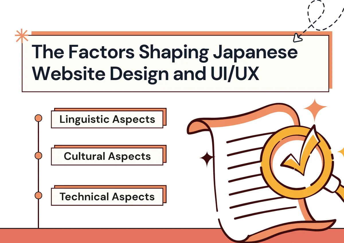
Japanese website design is renowned for its complexity, influenced by a combination of linguistic, cultural, and technical factors that shape the user experience. Understanding these elements is crucial for comprehending why Japanese UI tends to be more intricate than Western web design. In the following sections, we will delve deeper into these factors to explore their specific impacts on Japanese website designs.
The Japanese language—rich in kanji, hiragana, and katakana—plays a major role in shaping the visual design of websites. Unlike languages with uppercase, lowercase, or italics, Japanese lacks visual emphasis tools. As a result, designers rely heavily on:
Additionally, because Japanese characters can convey more meaning in fewer spaces, websites often feature densely packed information that still feels visually balanced to local audiences.
For global brands: Avoid sparse text layouts. Japanese users expect rich, text-supported visuals.

Japanese UI/UX is deeply shaped by cultural values such as:
In contrast, Western UI/UX often prioritizes speed and emotional triggers over depth of information.
Remember that Japanese users value control, choice, and detailed transparency in how they interact with websites.
Japan's early leadership in mobile web technology (even pre-smartphone) influenced a preference for:
Even today, despite Japan’s technological advancement, some users—especially older demographics—may still favor familiar, dense layouts over ultra-modern minimalism.
For website design: Prioritize lightweight images, concise yet comprehensive content, and responsive layouts.
For UI/UX: Ensure mobile versions maintain all necessary information without sacrificing usability.
Landing pages play a particularly important role in Japanese digital strategy—arguably more so than in many Western markets. While landing pages are used globally for conversions, product launches, or lead generation, in Japan they carry additional cultural and functional significance. To succeed, international businesses must adapt both the visual design and the user experience to meet Japanese expectations.
In this section, we explore the cultural reasons behind Japan’s reliance on landing pages, how the design and UI/UX of Japanese landing pages differ from Western approaches, and share practical examples and best practices for building high-performing landing pages for the Japanese market.
One key cultural factor behind the widespread use of landing pages in Japan is the cultural value of 配慮 (hairyo)—the deep consideration of others’ needs—and Omotenashi, the spirit of hospitality. Japanese businesses often take extra care to ensure that users are not left to guess or figure things out on their own. Instead, they prefer to present specific, curated information for each user intent, making the path to action clear, supportive, and guided.
In contrast, Western websites often assume the user will explore the site independently, relying on intuitive navigation and minimal content. While this works well in cultures that value autonomy and efficiency, Japanese users tend to appreciate dedicated pages tailored to particular goals or products, even if this means navigating multiple landing pages.
Japanese Approach:
Western Approach:
Visual Design Differences (Website Design)
In Japan, the visual design of landing pages often mirrors the characteristics of the broader web landscape:
International companies targeting Japan should consider that while visual simplicity (inspired by Zen aesthetics) is respected, in digital practice users often expect rich content density that allows them to make informed decisions without clicking away or searching for missing details.
Key Visual Design Elements in Japanese Landing Pages:
In contrast, Western landing pages typically:
UI/UX Differences
The UI/UX of Japanese landing pages is shaped by user expectations for:
Western UI/UX tends to:
In Japan, trust comes from thoroughness.
In the West, trust often comes from simplicity and visual polish.

To create an effective Japanese landing page, both the design and the experience must work together to reflect cultural expectations while ensuring usability and conversion.
1. Clear, Informative Titles (Website Design & UI)
2. Subheadings That Offer Reassurance (UI/UX)
3. Strong, Relevant Visuals (Website Design)
4. Trust-Building Elements (UI/UX)
5. Strong, Multiple CTAs (UI/UX)
「無料で試す」 (Try for Free)
「詳細を見る」 (View Details)
Creating an effective digital presence in Japan requires more than just translating content. Success comes from adapting both the visual design of the website and the user experience (UI/UX) to align with local cultural expectations, search behaviors, and user preferences.
Here, we break down the key strategies into two distinct areas:
1. Website Design—how your site looks, feels, and communicates visually.
2. UI/UX—how users interact with your site, make decisions, and move through the digital journey.
Visual and Content Localization:
Being sensitive to these cultural color associations in your design reinforces brand authenticity.
Search Engine Optimization for Visual Design:
1. User Journey & Interaction:
2. Politeness and Formal UI Microcopy:
3. Multilingual SEO and UI Considerations:
4. Cross-Channel UX Touchpoints:
In understanding Japanese website design, it becomes evident that it diverges significantly from Western norms. While Western designs often favor minimalism and visual appeal, Japanese websites tend to prioritize functionality and comprehensive information delivery. This approach caters to a user base that values depth of content and thoroughness, reflecting broader cultural preferences for detail-oriented experiences.
Key elements of Japanese website designs include text-heavy layouts, efficient space utilization, optimized images for speed, and vibrant color schemes that evoke emotional responses. Navigating Japanese web design complexities involves addressing linguistic nuances and tailoring strategies to local SEO and mobile optimization demands. As Japan's digital landscape evolves, websites must find a balance between maintaining user familiarity and adapting to modern trends.
Successful strategies in Japanese web design emphasize localization, strategic SEO, and creating clear, trustworthy landing pages. Building sites with a keen understanding of user preferences ensures alignment with UX expectations and enhances engagement across diverse demographics.
Emphasizing depth, functionality, and user-centric design empowers businesses to craft compelling digital experiences that deeply resonate within Japanese UI and website designs. Partnering with a local agency enhances this endeavor, offering invaluable insights and expertise to navigate the intricacies of Japanese website design. This collaboration ensures effective engagement and aligns strategies closely with user expectations, paving the way for sustained success in the Japanese market.
| Category | Actionable Insight for Japan |
|---|---|
| Website Design: Layout & Structure | Use dense, information-rich layouts that present comprehensive content upfront. Avoid excessive whitespace and ensure all key details are visible without excessive clicking. |
| Website Design: Visual Style | Incorporate bright, high-contrast colors and design elements like banners, character mascots, and seasonal themes to attract attention and convey warmth. |
| Website Design: Image Usage | Use small, optimized images that support navigation and complement text. Prioritize speed and mobile performance without sacrificing information density. |
| Website Design: Typography & Text | Utilize varied font sizes, colors, and weights to establish visual hierarchy. Include detailed, explanatory copy to build trust and clarity. |
| UI/UX: User Preferences | Provide multiple options and user paths to accommodate individual decision styles. Avoid forcing users into a single funnel. |
| UI/UX: Communication Tone | Use polite, formal Japanese in all microcopy, buttons, and instructions to convey professionalism and respect. |
| UI/UX: Trust & Transparency | Include certifications, guarantees, customer reviews, FAQs, and return policies prominently to address user concerns upfront. |
| UI/UX: Navigation & Flow | Design for self-guided journeys with clear structure. Include redundant navigation elements like multiple menus and CTAs to reduce user uncertainty. |
| UI/UX: Landing Pages | Create detailed, purpose-specific landing pages tailored to each product, campaign, or user intent. Support each page with long-form content and visual trust signals. |
Japanese website design and UI/UX aren’t just about aesthetics—they're deeply rooted in cultural nuance, user behavior, and trust-building strategies. If your brand is serious about breaking into the Japanese market, localization must go beyond language and into the very fabric of your digital presence.
At IGNITE, we don’t just translate—we transform.
As a multilingual digital marketing agency based in Osaka, we specialize in localizing websites, UI/UX flows, and full marketing ecosystems for international companies entering Japan. From culturally attuned website design and SEO-optimized content to tailored landing pages and trust-building UX, our team knows how to craft experiences that resonate with Japanese users and convert.
Why Choose IGNITE?
Partner With IGNITE: Your Local Marketing Division in Japan
Let us help you navigate the cultural, linguistic, and technical landscape of Japanese web design.
We’re not just a vendor—we’re your on-the-ground team dedicated to your success in Japan.
Contact us today to schedule a consultation and start localizing your digital strategy for Japan.
Website designer and developer specializing in creating websites and marketing assets for the Japanese and global markets. Focuses on UI/UX design that supports marketing goals.

Find the right service to grow your business in Japan.